
R 中的元素周期表?是的!这是可能的。即使没有附加软件包!
方法如下
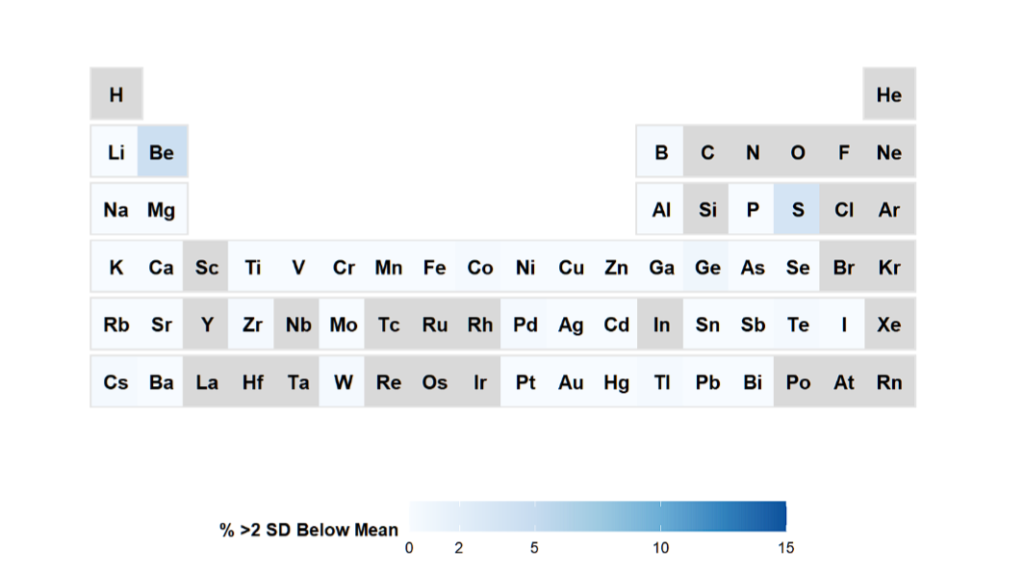
假设您想知道数据中哪些受试者的元素浓度低于 2SD。
library(ggplot2)
library(dplyr)

# =============================================================================
# Step 1: Get all measured hair elements and calculate 2SD prevalence
# =============================================================================

# All potential elements (adjust based on your data)
all_elements <- c("ag", "al", "as", "au", "b", "ba", "be", "bi", "ca", "cd",
                  "co", "cr", "cs", "cu", "fe", "ga", "gd", "ge", "hg", "i",
                  "k", "li", "lu", "mg", "mn", "mo", "na", "nb", "ni", "p",
                  "pb", "pd", "pt", "rb", "s", "sb", "sc", "se", "si", "sn",
                  "sr", "te", "th", "ti", "tl", "u", "v", "w", "y", "zn", "zr")


# Calculate 2SD below mean for each element
calc_low_2sd <- function(x) {
  if(sum(!is.na(x)) >= 10) {
    mean_val <- mean(x, na.rm = TRUE)
    sd_val <- sd(x, na.rm = TRUE)
    if(sd_val > 0) {
      z_scores <- (x - mean_val) / sd_val
      n_low <- sum(z_scores < -2, na.rm = TRUE)
      pct_low <- (n_low / sum(!is.na(z_scores))) * 100
      return(pct_low)
    }
  }
  return(NA)
}

# Apply to all elements
prevalence_2sd <- data.frame(
  element = all_elements,
  pct_low = sapply(all_elements, function(e) calc_low_2sd(hair_baseline[[e]])),
  n_total = sapply(all_elements, function(e) sum(!is.na(hair_baseline[[e]])))
) %>%
  mutate(
    Symbol = paste0(toupper(substr(element, 1, 1)),
                   tolower(substr(element, 2, nchar(element))))
  ) %>%
  filter(!is.na(pct_low)) %>%
  select(Symbol, pct_low) %>%
  rename(DeficiencyPct = pct_low)

# =============================================================================
# Step 2: FULL periodic table with all elements
# =============================================================================

e_table_full <- data.frame(
  Symbol = c(
    # Period 1
    "H", "He",
    # Period 2
    "Li", "Be", "B", "C", "N", "O", "F", "Ne",
    # Period 3
    "Na", "Mg", "Al", "Si", "P", "S", "Cl", "Ar",
    # Period 4
    "K", "Ca", "Sc", "Ti", "V", "Cr", "Mn", "Fe", "Co", "Ni", "Cu", "Zn",
    "Ga", "Ge", "As", "Se", "Br", "Kr",
    # Period 5
    "Rb", "Sr", "Y", "Zr", "Nb", "Mo", "Tc", "Ru", "Rh", "Pd", "Ag", "Cd",
    "In", "Sn", "Sb", "Te", "I", "Xe",
    # Period 6
    "Cs", "Ba", "La", "Hf", "Ta", "W", "Re", "Os", "Ir", "Pt", "Au", "Hg",
    "Tl", "Pb", "Bi", "Po", "At", "Rn"
  ),
  Graph.Group = c(
    1, 18,
    1, 2, 13, 14, 15, 16, 17, 18,
    1, 2, 13, 14, 15, 16, 17, 18,
    1, 2, 3, 4, 5, 6, 7, 8, 9, 10, 11, 12, 13, 14, 15, 16, 17, 18,
    1, 2, 3, 4, 5, 6, 7, 8, 9, 10, 11, 12, 13, 14, 15, 16, 17, 18,
    1, 2, 3, 4, 5, 6, 7, 8, 9, 10, 11, 12, 13, 14, 15, 16, 17, 18
  ),
  Graph.Period = c(
    1, 1,
    2, 2, 2, 2, 2, 2, 2, 2,
    3, 3, 3, 3, 3, 3, 3, 3,
    4, 4, 4, 4, 4, 4, 4, 4, 4, 4, 4, 4, 4, 4, 4, 4, 4, 4,
    5, 5, 5, 5, 5, 5, 5, 5, 5, 5, 5, 5, 5, 5, 5, 5, 5, 5,
    6, 6, 6, 6, 6, 6, 6, 6, 6, 6, 6, 6, 6, 6, 6, 6, 6, 6
  )
)

# =============================================================================
# Step 3: Merge and plot
# =============================================================================

plot_data <- e_table_full %>%
  left_join(prevalence_2sd, by = "Symbol")

ggplot(plot_data) +
  geom_point(aes(y = Graph.Period, x = Graph.Group),
             size = 14, shape = 15, color = "gray90") +
  geom_point(aes(y = Graph.Period, x = Graph.Group, colour = DeficiencyPct),
             size = 13, shape = 15) +
  geom_text(colour = "black", size = 4, fontface = "bold",
            aes(label = Symbol, y = Graph.Period, x = Graph.Group)) +
  scale_x_continuous(breaks = seq(1, 18), limits = c(0, 19), expand = c(0,0)) +
  scale_y_continuous(trans = "reverse", breaks = seq(1, 7),
                     limits = c(7.5, -0.5), expand = c(0,0)) +
  scale_colour_gradientn(
    breaks = c(0, 2, 5, 10, 15),
    limits = c(0, 15),
    colours = c("#f7fbff", "#deebf7", "#c6dbef", "#9ecae1", "#6baed6", "#3182bd", "#08519c"),
    na.value = "grey85",
    name = "% >2 SD Below Mean"
  ) +
  labs(
    title = "Element Analysis in Your Cohort (2 SD Method)"
      )+
  theme(
    panel.grid.major = element_blank(),
    panel.grid.minor = element_blank(),
    plot.margin = unit(c(0.5, 0.5, 0, 0), "line"),
    axis.title = element_blank(),
    axis.text = element_blank(),
    axis.ticks = element_blank(),
    panel.background = element_blank(),
    plot.background = element_rect(fill="white", colour=NA),
    plot.title = element_text(hjust = 0.5, size = 14, face = "bold"),
    plot.subtitle = element_text(hjust = 0.5, size = 10, color = "grey30"),
    legend.position = "bottom",
    legend.direction = "horizontal",
    legend.key.width = unit(3, "line"),
    legend.title = element_text(size = 10, face = "bold")
  )
我们得到的结果是

灰色元素无法测量,白色元素可以测量,蓝色元素可以测量,但可能会更低。当然,您也可以在这里定义自己的阈值。