
Periodic Table of Elements in R? Yes! That is possible. Even without the addditional package!
Here is how.
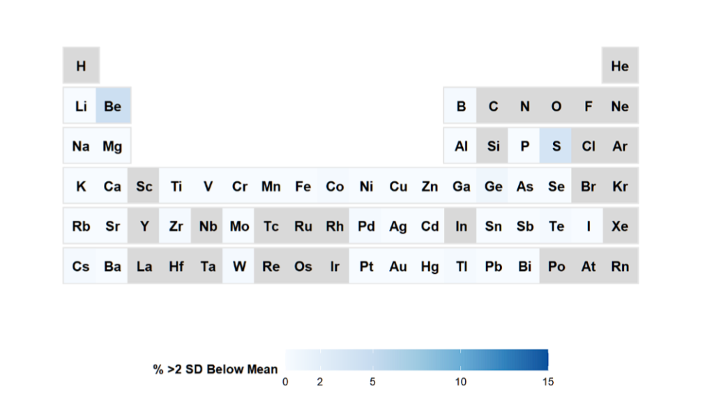
Suppose you would like to know which subjects in your data have the concentration of the elements below 2SD.
library(ggplot2)
library(dplyr)

# =============================================================================
# Step 1: Get all measured hair elements and calculate 2SD prevalence
# =============================================================================

# All potential elements (adjust based on your data)
all_elements <- c("ag", "al", "as", "au", "b", "ba", "be", "bi", "ca", "cd",
                  "co", "cr", "cs", "cu", "fe", "ga", "gd", "ge", "hg", "i",
                  "k", "li", "lu", "mg", "mn", "mo", "na", "nb", "ni", "p",
                  "pb", "pd", "pt", "rb", "s", "sb", "sc", "se", "si", "sn",
                  "sr", "te", "th", "ti", "tl", "u", "v", "w", "y", "zn", "zr")


# Calculate 2SD below mean for each element
calc_low_2sd <- function(x) {
  if(sum(!is.na(x)) >= 10) {
    mean_val <- mean(x, na.rm = TRUE)
    sd_val <- sd(x, na.rm = TRUE)
    if(sd_val > 0) {
      z_scores <- (x - mean_val) / sd_val
      n_low <- sum(z_scores < -2, na.rm = TRUE)
      pct_low <- (n_low / sum(!is.na(z_scores))) * 100
      return(pct_low)
    }
  }
  return(NA)
}

# Apply to all elements
prevalence_2sd <- data.frame(
  element = all_elements,
  pct_low = sapply(all_elements, function(e) calc_low_2sd(hair_baseline[[e]])),
  n_total = sapply(all_elements, function(e) sum(!is.na(hair_baseline[[e]])))
) %>%
  mutate(
    Symbol = paste0(toupper(substr(element, 1, 1)),
                   tolower(substr(element, 2, nchar(element))))
  ) %>%
  filter(!is.na(pct_low)) %>%
  select(Symbol, pct_low) %>%
  rename(DeficiencyPct = pct_low)

# =============================================================================
# Step 2: FULL periodic table with all elements
# =============================================================================

e_table_full <- data.frame(
  Symbol = c(
    # Period 1
    "H", "He",
    # Period 2
    "Li", "Be", "B", "C", "N", "O", "F", "Ne",
    # Period 3
    "Na", "Mg", "Al", "Si", "P", "S", "Cl", "Ar",
    # Period 4
    "K", "Ca", "Sc", "Ti", "V", "Cr", "Mn", "Fe", "Co", "Ni", "Cu", "Zn",
    "Ga", "Ge", "As", "Se", "Br", "Kr",
    # Period 5
    "Rb", "Sr", "Y", "Zr", "Nb", "Mo", "Tc", "Ru", "Rh", "Pd", "Ag", "Cd",
    "In", "Sn", "Sb", "Te", "I", "Xe",
    # Period 6
    "Cs", "Ba", "La", "Hf", "Ta", "W", "Re", "Os", "Ir", "Pt", "Au", "Hg",
    "Tl", "Pb", "Bi", "Po", "At", "Rn"
  ),
  Graph.Group = c(
    1, 18,
    1, 2, 13, 14, 15, 16, 17, 18,
    1, 2, 13, 14, 15, 16, 17, 18,
    1, 2, 3, 4, 5, 6, 7, 8, 9, 10, 11, 12, 13, 14, 15, 16, 17, 18,
    1, 2, 3, 4, 5, 6, 7, 8, 9, 10, 11, 12, 13, 14, 15, 16, 17, 18,
    1, 2, 3, 4, 5, 6, 7, 8, 9, 10, 11, 12, 13, 14, 15, 16, 17, 18
  ),
  Graph.Period = c(
    1, 1,
    2, 2, 2, 2, 2, 2, 2, 2,
    3, 3, 3, 3, 3, 3, 3, 3,
    4, 4, 4, 4, 4, 4, 4, 4, 4, 4, 4, 4, 4, 4, 4, 4, 4, 4,
    5, 5, 5, 5, 5, 5, 5, 5, 5, 5, 5, 5, 5, 5, 5, 5, 5, 5,
    6, 6, 6, 6, 6, 6, 6, 6, 6, 6, 6, 6, 6, 6, 6, 6, 6, 6
  )
)

# =============================================================================
# Step 3: Merge and plot
# =============================================================================

plot_data <- e_table_full %>%
  left_join(prevalence_2sd, by = "Symbol")

ggplot(plot_data) +
  geom_point(aes(y = Graph.Period, x = Graph.Group),
             size = 14, shape = 15, color = "gray90") +
  geom_point(aes(y = Graph.Period, x = Graph.Group, colour = DeficiencyPct),
             size = 13, shape = 15) +
  geom_text(colour = "black", size = 4, fontface = "bold",
            aes(label = Symbol, y = Graph.Period, x = Graph.Group)) +
  scale_x_continuous(breaks = seq(1, 18), limits = c(0, 19), expand = c(0,0)) +
  scale_y_continuous(trans = "reverse", breaks = seq(1, 7),
                     limits = c(7.5, -0.5), expand = c(0,0)) +
  scale_colour_gradientn(
    breaks = c(0, 2, 5, 10, 15),
    limits = c(0, 15),
    colours = c("#f7fbff", "#deebf7", "#c6dbef", "#9ecae1", "#6baed6", "#3182bd", "#08519c"),
    na.value = "grey85",
    name = "% >2 SD Below Mean"
  ) +
  labs(
    title = "Element Analysis in Your Cohort (2 SD Method)"
      )+
  theme(
    panel.grid.major = element_blank(),
    panel.grid.minor = element_blank(),
    plot.margin = unit(c(0.5, 0.5, 0, 0), "line"),
    axis.title = element_blank(),
    axis.text = element_blank(),
    axis.ticks = element_blank(),
    panel.background = element_blank(),
    plot.background = element_rect(fill="white", colour=NA),
    plot.title = element_text(hjust = 0.5, size = 14, face = "bold"),
    plot.subtitle = element_text(hjust = 0.5, size = 10, color = "grey30"),
    legend.position = "bottom",
    legend.direction = "horizontal",
    legend.key.width = unit(3, "line"),
    legend.title = element_text(size = 10, face = "bold")
  )
And what we obtain is:

Grey elements are not measured, white are ok and blue are of interest, with potential lower levels. Of course, one can define your own thresholds here.