

Radar charts are still not so common as their other sisters and brothers. They alllow to show the differences among the groups for many variables at once. They work well if you have some kind of maximum for these variables. Also, if you don’t have so many groups to compare, ideally 2-3. And if you are not interested in the distributions themselves.
Still, they are visually attractive and may be a nice part of, for dynamic Shiny application.
Below is the simple code for a radar plot for Parkinson’s symptoms data. Every symptom is scored from 0-100. Since the data is longitudinal, the function allows for plotting it at some given point in time. Also, ordering by severity is enabled.
The function works for binary group.
Plot.Bin.Radar<-function(timepoint,group,order_by_severity = FALSE){

#reading symptoms data#

data.symptoms<-data.frame(ID=m.data$participant_id,slow=m.data$slow,            constipation=m.data$constipation,walk=m.data$walk,freezing=m.data$freezing,                           falls=m.data$falls,rising=m.data$rising,dressing=m.data$dressing,                            motivation=m.data$motivation,handwriting=m.data$handwriting,
depression=m.data$depression,withrawn=m.data$withdrawn,
anxiety=m.data$anxiety,fatigue=m.data$fatigue,
sleepy=m.data$sleepy,dyskinesia=m.data$dyskinesia,
tremor=m.data$tremor,balance=m.data$balance,
dizzy=m.data$dizzy,visual=m.data$visual,insomnia=m.data$insomnia,
rbd=m.data$rbd,restlesslegs=m.data$restlesslegs,
musclepain=m.data$musclepain,speech=m.data$speech,
drool=m.data$drool,stoop=m.data$stoop,
memory=m.data$memory,comprehension=m.data$comprehension,smell=m.data$smell,
sexual=m.data$sexual,urinary=m.data$urinary,
hallucinations=m.data$hallucinations,nausea=m.data$nausea,time=m.data$TimeCont)

#where group variable in the data#
where.group<-which(names(m.data)==group)

data.symptoms.0<-data.symptoms[(data.symptoms$time==timepoint)&(m.data[,where.group]==0),]
data.symptoms.12<-data.symptoms[(data.symptoms$time==timepoint)&(m.data[,where.group]==1),]


all.symptoms.0 <- data.frame(sapply(data.symptoms.0, function(x) as.numeric(as.character(x))))
all.symptoms.12 <- data.frame(sapply(data.symptoms.12, function(x) as.numeric(as.character(x))))


av.symp.0<-colMeans(all.symptoms.0, na.rm=TRUE)
av.symp.12<-colMeans(all.symptoms.12, na.rm=TRUE)

data <- as.data.frame(rbind(av.symp.0[2:34],av.symp.12[2:34]))

#ordering by severity#

  if (order_by_severity) {
    # Calculate mean severity across both groups
    mean_severity <- colMeans(data, na.rm = TRUE)
    ordered_symptoms <- names(sort(mean_severity, decreasing = TRUE))
    data <- data[, ordered_symptoms]
  }

get.labels<-names.data$Field.Label[names.data$Variable.Field.Name==group]

rownames(data) <- c(paste0(" No ", timepoint,"m."),paste0(" Yes ",timepoint,"m."))

# To use the fmsb package, I have to add 2 lines to the dataframe: the max and min of each variable to show on the plot!

 data <- rbind(rep(100,33) , rep(0,33) , data)

# Color vector (borders and filling)#

colors_border=c( rgb(0.2,0.5,0.5,0.9), rgb(0.8,0.2,0.5,0.9) , rgb(0.7,0.5,0.1,0.9),rgb(0.1,0.1,0.9,0.9))
colors_in=c( rgb(0.2,0.5,0.5,0.4), rgb(0.8,0.2,0.5,0.4) , rgb(0.7,0.5,0.1,0.4),rgb(0.1,0.1,0.9,0.4) )

  # plot with default options:
  radarchart( data  , axistype=1 ,
              #custom polygon
              pcol=colors_border , pfcol=colors_in , plwd=4 , plty=1,
              #custom the grid
              cglcol="grey", cglty=1, axislabcol="grey", caxislabels=seq(0,20,5), cglwd=0.8, vlcex=0.8,title=get.labels)
  legend(x=0.8, y=1.3, legend = rownames(data[-c(1,2),]), bty = "n", pch=20 ,
         col=colors_border , text.col = "black", cex=1, pt.cex=2)
  if (order_by_severity) {
    mtext("Symptoms ordered by mean severity across all groups",
          side = 1, line = 4, cex = 0.9, col = "grey40")
  }

}
Plot.Bin.Radar(0,"gender",order_by_severity = TRUE)
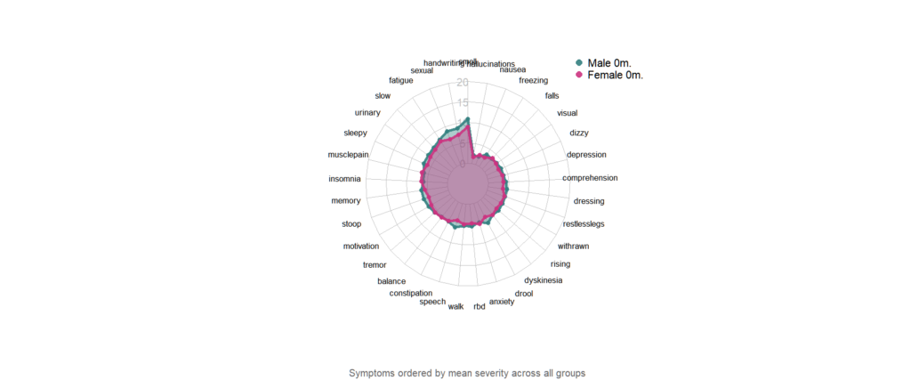
As the result of Plot.Bin.Radar(0,”gender”,order_by_severity = TRUE) funcion calling we have the plot as above. For gender, for 0 months (baseline). Imagine now the Shiny app with time as the slider:
library(shinydashboard)

ui <- dashboardPage(
  dashboardHeader(title = "Parkinson dashboard"),
  dashboardSidebar(),
  dashboardBody(
    # Boxes need to be put in a row (or column)
    fluidRow(
      box(width = 6,plotOutput("plot1", height = 450)),

      box(
        title = "Baseline vs another time point",
        sliderInput("slider", "Choose time point:", 0, 24, 6)
      )
    )
  )
)

server <- function(input, output) {

 library(fmsb)


  your.data <- read.csv("mydata.csv")
  #do some data management here#


  source("park_functions.R")

  output$plot1 <- renderPlot({
    Plot.Radar(input$slider)

  })
}

shinyApp(ui, server)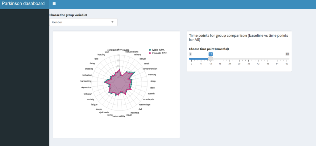
Then upload the app on shiny server and viola! It saves you like 1000 of plots and is really fun to explore!
Good luck!